
















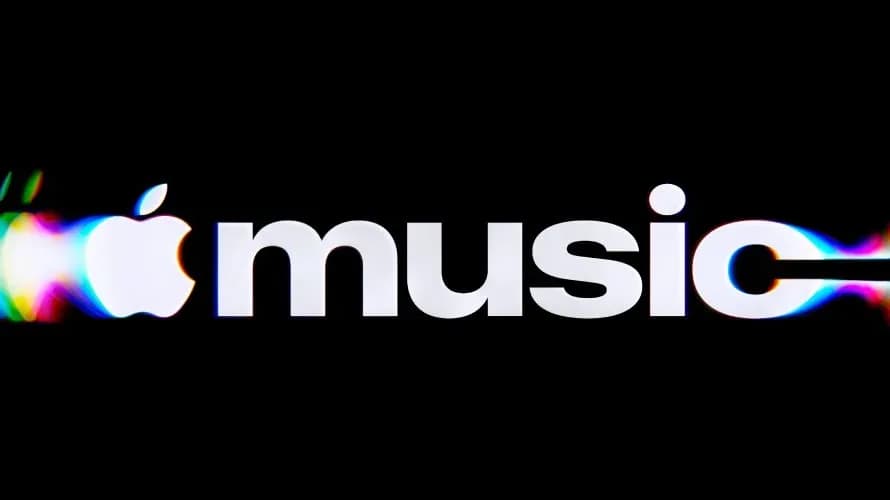
Apple Music has unveiled a new brand identity built around the idea of “made by sound”, reworking the streaming service’s visual language through waves, ripples and light created from musical frequencies.
The new identity includes a redesigned mnemonic logo that translates sound into physical movement, moving beyond a purely graphic representation. Apple says the visuals are designed to reflect the movement of sound itself, giving the brand a distinct look rooted in the experience of music.
Also Read | Kolkata Durga Puja: Meet the invisible heroes who build the pandals
The redesign also draws on Apple’s Liquid Glass design language, bringing the music service closer to the visual style used across the company’s wider ecosystem.
How did Apple Music create its new logo?
The new Apple Music logo was created by translating audio frequencies into physical vibrations. Apple used a transducer, a device that converts an audio signal into vibration, to move liquid in a shallow bath of mineral oil in response to musical notes.
The resulting waves and ripples were filmed and used to create the final mark, making the logo a visual record of sound rather than an image created solely through conventional graphic design.
Introducing a new identity for Apple Music, physically shaped by an original composition from @fredagainagain1 and NEST Acoustics. https://t.co/LFXLIfexPL
— Apple Music (@AppleMusic) October 21, 2026
For the project, Apple partnered with music producer Fred again.. and his collaborator NEST Acoustics. The process places the physical properties of sound at the centre of the new identity, with movement and texture shaping the final visual.
The company has described the concept as “made by sound”, reflecting its approach of using the behaviour of musical frequencies as the basis for the design.
How does Liquid Glass influence Apple Music’s new identity?
Alongside the new symbol, Apple Music has introduced a custom version of SF Pro, Apple’s typeface. The company says the bold, lowercase letterforms give the identity a more energetic personality while retaining a recognisable Apple aesthetic.
The design also incorporates elements of Liquid Glass, the visual language Apple introduced at WWDC 2025. The style uses the optical qualities of glass as part of its interface design, and Apple says the new Music identity brings those qualities together with the movement of waves and vibrations.
Go behind the scenes of Made by Sound. A story of music, collaboration and craft with @fredagainagain1 and NEST Acoustics. Discover how sound brought the Apple Music logo to life, captured entirely in camera. Just music, made visible. https://t.co/ZyMRGdUVUX
— Apple Music (@AppleMusic) October 21, 2026
Apple began rolling out Liquid Glass across its operating systems with the launch of iOS 26, iPadOS 26, macOS Tahoe 26, watchOS 26 and tvOS 26. The Apple Music redesign extends that visual approach to one of its major services.
Also Read | 7 things that aren’t cringe but people judge you for doing
The company had previously teased its new wordmark around the opening of Apple Music Hall in London. The latest unveiling develops that direction into a broader identity built around sound, motion and glass-inspired visuals.
With the redesign, Apple Music is presenting its brand as more than a streaming-service logo: the identity connects the physical movement of sound with the visual language Apple is establishing across its products and services.